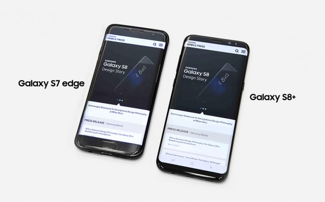
The Infinity Display, with its continuous surface, and absence of buttons and harsh angles, is perhaps the most visibly distinct attribute of the new Galaxy S8 and S8+. But there’s a lot more to its stunning screen than meets the eye. In fact, it represents new heights in technology, UX design and viewing experience – all the result of Samsung’s dedication to creating meaningful, user-inspired technology.
Once the Infinity Display concept was confirmed, designers made the decision to move the Home button from the front of the device to behind the display to free up screen space. Although not physically visible to the user, the pressure-sensitive button would utilize touch haptic feedback to simulate the feel of an actual button press.
Not only does the Galaxy S8’s Infinity Display offer an immersive viewing experience but its new 18.5:9 screen ratio makes for a cinematic one, as well.
While TV shows, movies and video content of the recent past have generally been produced in a 16:9 aspect ratio, video providers of today and tomorrow are beginning to embrace widescreen ratios of up to 21:9.
When watched in landscape mode, 21:9 movies fill the Galaxy S8’s 18.5:9 display, while the black bars above and below the picture are minimized, increasing the viewing area by 36 percent, compared to the Galaxy S7.
While the Galaxy S8’s Infinity Display takes the mobile entertainment experience to the next level, it’s also optimized for multitasking, making work and on-the-go tasks easier and more efficient.
With more screen real estate, users can make use of the phone’s multi-window functionality to perform multiple tasks at once, such as watching a video while typing a message using the full keyboard. The new Snap Window feature, meanwhile, lets them pin a specific area from a recent app to the top of the screen, and continue using the area below it to work and view content seamlessly.
The Galaxy S8 has also been optimized for one-handed operation, with a focus on reducing scrolling within the phone’s navigation screens as well as within timeline-based applications like social networking sites.
Further, engineers have built in shortcuts to make using the phone even more convenient, including a swipe gesture that allows users to reach the furthest corners of the screen without having to reposition the phone or their hands.


